What Are Cream Aluminium Windows
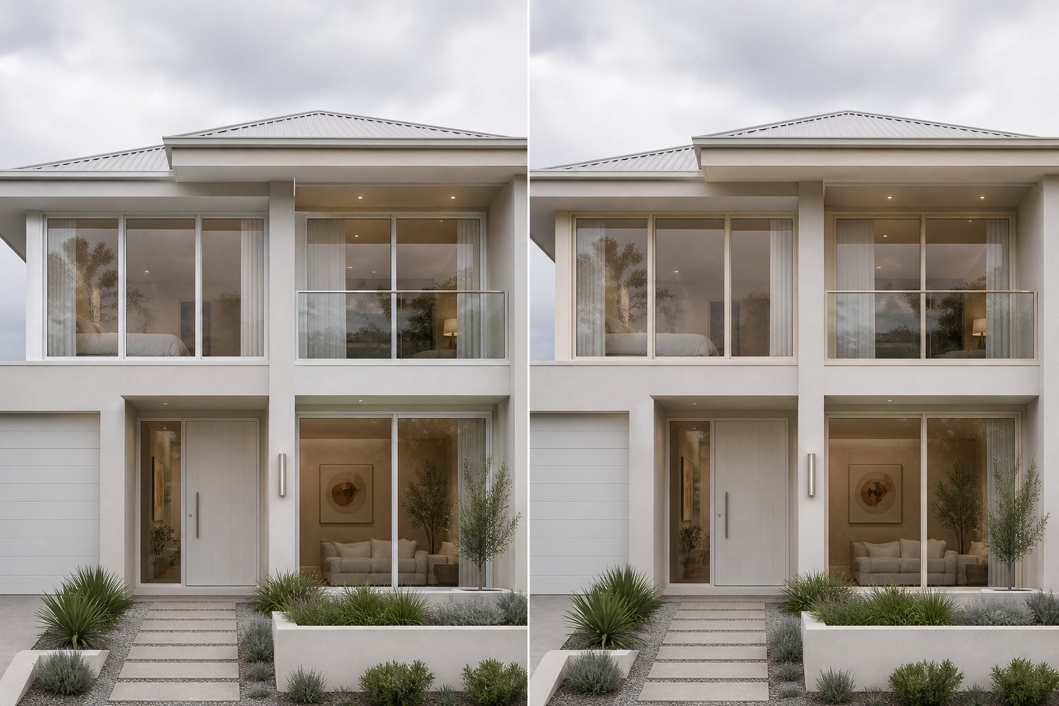
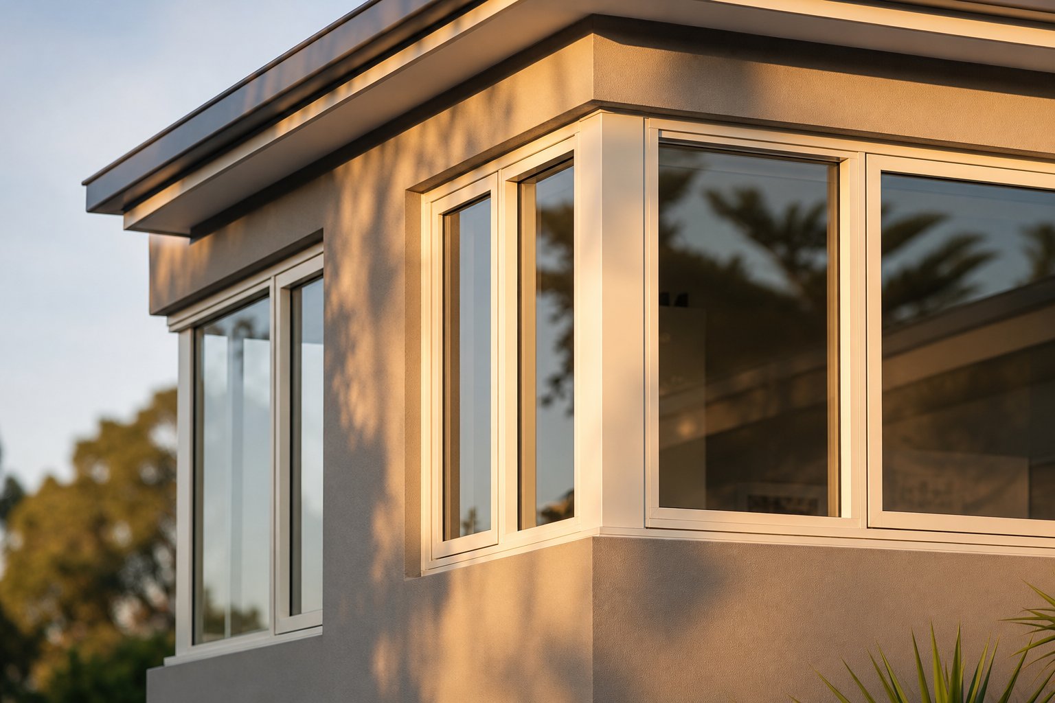
Cream aluminium windows are aluminium-framed window systems finished in a warm, off-white powder-coat colour — typically specified as RAL 9001 (Cream) — that sits between pure white and ivory on the colour spectrum. The finish delivers a softer, warmer tone than stark white while retaining a neutral, light appearance suited to both traditional and modern facades.
Picture a freshly rendered wall catching the afternoon sun. A bright white frame can look almost harsh against that warmth, while a beige window tone blends too far into the background. Cream sits in the sweet spot — light enough to feel fresh, warm enough to feel grounded.
What Makes a Window Frame Cream Rather Than White
The difference comes down to undertone. Pure white aluminium frames, such as those finished in RAL 9016 (Traffic White) or RAL 9003 (Signal White), carry a cool, blue-grey base. Cream introduces a yellow or warm-grey undertone that softens the overall appearance. In industry terms, the go-to specification is RAL 9001, which powder coaters recognise as a creamy white with a subtle warmth that reads distinctly different from clinical white under natural light.
This isn’t simply a matter of adding more pigment. The powder-coating process bakes the colour into the aluminium profile at around 200 degrees Celsius, locking in a consistent tone that won’t shift over time the way painted timber can. The result is a frame that looks intentional rather than faded — a deliberate design choice, not a compromise.
Why Cream Is Growing in Popularity for Aluminium Frames
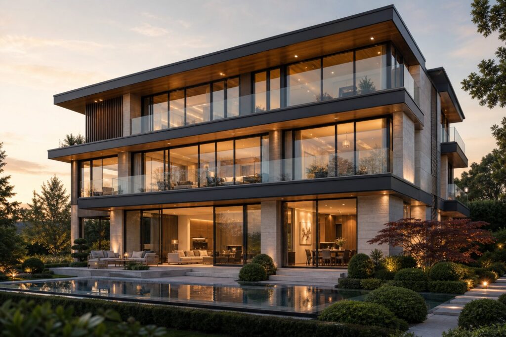
Homeowners and architects across Australia are gravitating toward cream for a few practical reasons. It pairs naturally with sandstone, warm-toned brick, and rendered finishes without creating the high-contrast clash that bright white sometimes produces. For heritage homes, conservation areas, and character overlays, cream often meets council colour requirements more comfortably than stark alternatives. And in contemporary builds leaning into earthy, organic palettes, a beige aluminum-toned frame ties exterior materials together with less visual tension.
Cream also bridges architectural styles. It works on a restored Edwardian terrace, a mid-century brick-veneer renovation, and a new coastal build with equal ease. The RAL colour system — an international standard used by powder coaters to guarantee colour accuracy — makes specifying cream straightforward regardless of your window supplier or project location.
That flexibility raises an obvious question: with so many warm-white shades available in the RAL chart, how do you pick the right one?
RAL Colour Codes for Cream Window Frames
The RAL Classic colour system gives powder coaters and window suppliers a universal language for specifying exact shades. Within the cream family, several codes sit close together on the spectrum, and picking the wrong one can mean your frames look noticeably different from what you imagined. Here’s how the key codes break down.
RAL 9001 Cream vs RAL 1013 Oyster White
RAL 9001 is the default specification most suppliers reach for when a client asks for cream aluminium windows. It reads as a warm, slightly yellowed white — not beige, but distinctly softer than anything in the pure white range. Think of it as the colour of unbleached linen held up to daylight.
RAL 1013 oyster white sits nearby but carries a slightly warmer, more golden undertone. Where RAL 9001 leans toward a muted, balanced warmth, RAL1013 picks up a hint of sand or straw — subtle, but visible when the two are placed side by side on a sample panel. Oyster white tends to complement yellow-toned sandstone and blonde brickwork particularly well, while RAL 9001 pairs more broadly across render colours and mixed-material facades.
RAL 1015 (Light Ivory) pushes the warmth further again, edging toward a pale custard tone. RAL 1014 (Ivory) is a step deeper still — warm enough that it reads as a distinct colour rather than a white variant. Both are viable choices for cream aluminium windows, though they tend to suit heritage projects where a richer tone helps frames recede against aged stonework or period detailing.
How Cream Shades Differ from Pure White RAL Codes
The boundary between cream and white sits squarely between RAL 9001 and the two dominant white codes: RAL 9003 (Signal White) and RAL 9016 (Traffic White). Signal white — RAL 9003 — is a cool, bright white with a faintly blue-grey cast. It looks crisp and clinical, which is exactly what minimalist contemporary builds aim for. RAL 9016, often called traffic white, is similarly bright but leans slightly neutral rather than cool. Neither carries any of the yellow warmth that defines cream.
Place a RAL 9001 sample next to RAL 9016, and the cream looks almost tinted by comparison. That contrast is exactly why specifying the right code matters — especially on a street-facing elevation where frames sit against render or cladding for decades.
Choosing a RAL Code Based on Your Facade Colours
Lighting conditions shift how every code reads in the real world. A south-facing wall bathed in direct sun will make cream frames appear lighter and more neutral, while shaded or overcast conditions draw out the yellow undertone. Surrounding materials amplify this effect too — cream against red brick looks quite different to cream against cool grey render.
The table below maps out the key codes, their undertones, and where each tends to work best architecturally.
| RAL Code | Colour Name | Undertone | Best Architectural Pairing |
|---|---|---|---|
| RAL 9001 | Cream | Warm yellow-grey, balanced | Broad use — render, brick, stone, and mixed facades |
| RAL 1013 | Oyster White | Golden-sand warmth | Blonde brick, sandstone, warm-toned cladding |
| RAL 1014 | Ivory | Deeper yellow, noticeably warm | Heritage stonework, period homes, conservation areas |
| RAL 9003 | Signal White | Cool blue-grey, bright | Contemporary minimalist, dark cladding contrast |
| RAL 9016 | Traffic White | Neutral bright, no warmth | Modern renders, crisp monochrome palettes |
A physical sample panel viewed against your actual facade materials remains the most reliable way to confirm your choice. Screen representations — including RAL fan decks photographed indoors — rarely capture how a powder-coated finish behaves under Australian sunlight. Request a sprayed aluminium sample from your supplier rather than relying on a painted swatch card, because the metallic substrate beneath the powder coat subtly influences the final appearance.
With the right code locked in, the next consideration is how cream stacks up against white in broader design terms — visual weight, ageing behaviour, and the overall impression each leaves on a streetscape.
Cream vs White Aluminium Windows Compared
Side by side on a sample board, cream and white look like close relatives. Installed on a facade and viewed from the street, they tell very different stories. The choice between them shapes how a home feels from the kerb — and how it holds up visually over the years.
Visual Impact of Cream vs White on Street-Facing Elevations
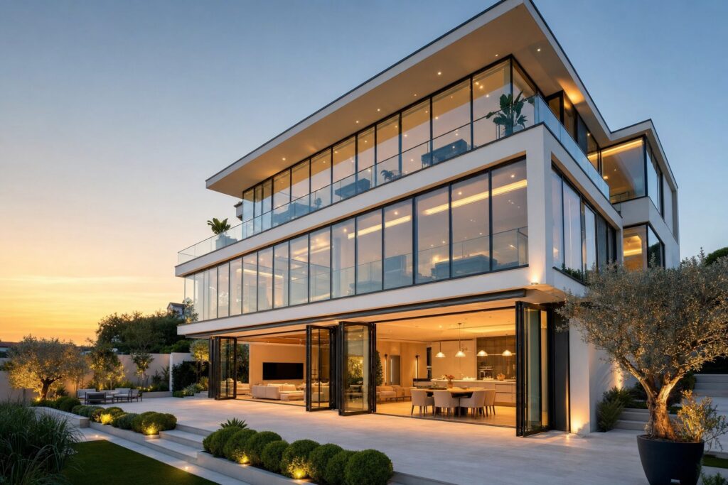
White aluminium windows deliver a sharp, high-contrast outline against most wall finishes. That crispness reads as contemporary and clean, which is why modern white aluminium windows remain the default for minimalist box-form builds and monochrome palettes. The frame pops forward, drawing the eye to the glazing pattern and proportions.
Cream takes a different approach. Its warm undertone absorbs into rendered and painted surfaces rather than cutting against them. On a cream or off-white rendered wall, cream frames create a tonal relationship instead of a hard edge — reducing glare contrast and softening the overall elevation. Design professionals often note that white windows can look too stark against warm-toned brick or earthy stone, while a slightly creamier tone integrates more naturally with those materials.
This matters most on street-facing elevations where the frames are seen at a distance and in changing light. A bright white frame against warm render can appear almost blue in overcast conditions, whereas cream maintains a consistent, settled appearance regardless of sky colour.
Which Light Shade Suits Your Exterior Palette
If your build leans into cool greys, dark cladding, or a stark monochrome palette, white aluminium windows sharpen that look. They suit the high-contrast aesthetic of contemporary architecture where clean lines and bold geometry do the talking.
Cream works better when the exterior palette trends warm — sandstone, blonde or red brick, natural timber accents, or rendered finishes in fawn, sand, or warm grey tones. It bridges traditional and modern aesthetics comfortably, sitting at home on a heritage terrace renovation just as easily as a new transitional build. One practical note on ageing: bright white frames can develop a slightly yellow cast over many years of UV exposure, and that shift is noticeable precisely because the original colour was so neutral. Cream frames age more gracefully — any subtle tonal drift blends into the existing warmth rather than reading as discolouration.
From a resale perspective, both remain safe, broadly appealing choices. White aluminium windows suit buyers drawn to clean, modern interiors, while cream appeals to those seeking warmth and character without the maintenance of painted timber. Neither limits future exterior colour updates the way a bold frame colour might.
| Factor | Cream Aluminium | White Aluminium |
|---|---|---|
| Appearance | Soft, warm, settled into the facade | Crisp, bright, high-contrast outline |
| Architectural suitability | Heritage, transitional, warm contemporary | Minimalist, monochrome, cool-toned modern |
| Ageing behaviour | Tonal shifts blend into existing warmth | Slight yellowing more visible over time |
| Maintenance visibility | Forgiving — dirt and watermarks less obvious | Shows grime quickly against bright base |
| Curb appeal | Warm, inviting, suits earthy palettes | Clean, contemporary, suits cool palettes |
Colour choice rarely exists in isolation, though. The facade materials, roof tone, landscaping, and even local planning requirements all weigh in. For homes where heritage character or conservation overlays guide exterior decisions, cream often emerges as the path of least resistance — and the most visually sympathetic result.
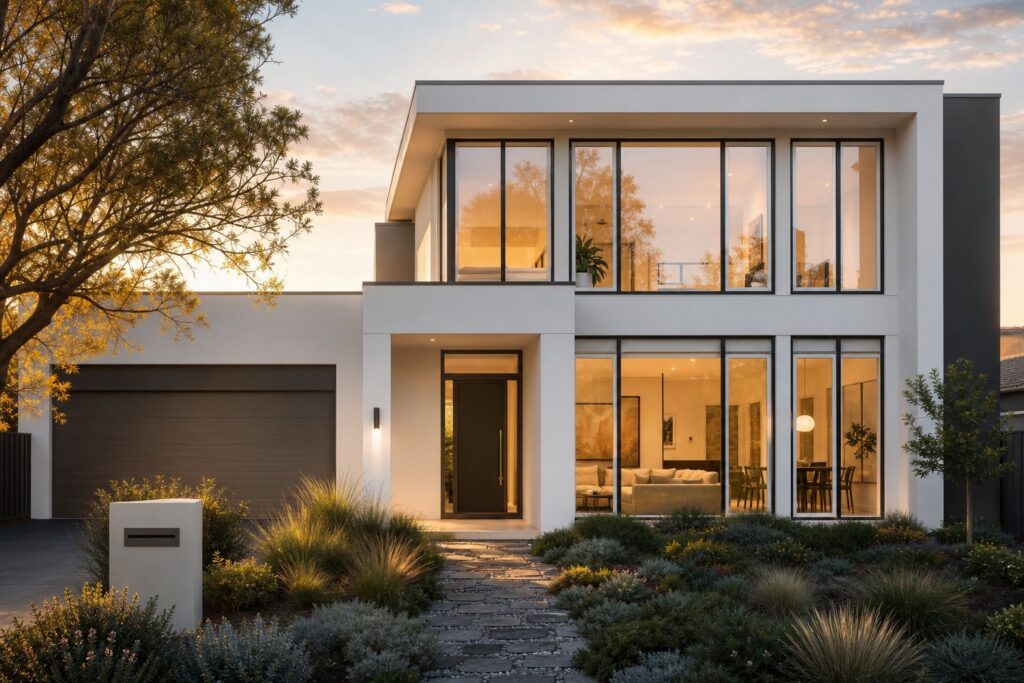
Architectural Styles That Suit Cream Frames
Cream doesn’t belong to a single era or design movement. Its quiet warmth lets it slip into vastly different architectural contexts — something stark white or bold greys rarely manage without careful balancing of surrounding materials.
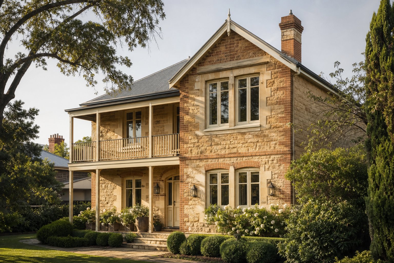
Cream Windows in Heritage and Character Homes
Period homes built from sandstone, warm brick, or traditional render carry a tonal palette that leans earthy and muted. Bright white frames can look like an afterthought on these facades, while cream reads as intentional — as though it grew up alongside the masonry. Federation terraces, Edwardian villas, and interwar bungalows across Sydney, Melbourne, and Adelaide benefit from that visual sympathy. Slim aluminium profiles finished in RAL 9001 replicate the proportions of original timber joinery without the rot, repainting, or warping that heritage timber frames inevitably demand.
Architectural styles where cream performs particularly well include:
- Federation and Edwardian homes with decorative detailing
- Californian bungalows and interwar cottages
- Queenslander and weatherboard renovations
- Mid-century brick-veneer homes transitioning to a softer palette
- Contemporary builds using warm neutrals and natural materials
- Rural homesteads surrounded by bushland and earthy tones
Pairing Cream Frames with Brick, Stone, and Render
Facade materials dictate how a frame colour lands. Against red or orange brick, cream softens the contrast without disappearing. Paired with blonde or sandstone masonry, it creates a near-tonal relationship that feels cohesive and grounded. On rendered exteriors painted in fawn brown, sand, or warm grey, cream frames blend into the overall palette rather than slicing through it.
Earthy accent colours strengthen the effect. A front door in sepia brown or a darker tone like RAL 8025 (Pale Brown) adds depth beside cream frames. Fascias or guttering in a mouse grey colour keep the roofline neutral without competing. Even landscaping plays a role — established gardens with olive-green foliage (think tones approaching RAL 6003 olive green) create a natural backdrop that makes cream frames feel settled and organic rather than stark or imposed.
For builds using cooler accent elements — an umbra grey garage door, dark window trims on a secondary elevation — cream provides the warm counterpoint that stops the facade reading as cold or industrial. Warm and cool tones in conversation across the same elevation give the design energy without visual conflict.
Conservation Area Colour Requirements
In conservation areas and heritage overlays, councils assess window replacements on their contribution to the overall character of the streetscape. Bright white aluminium can be flagged as visually unsympathetic where original joinery was painted in softer, warmer tones. Cream — particularly RAL 9001 or RAL 1013 — frequently satisfies heritage colour requirements because it echoes the aged patina of traditional painted timber without trying to replicate it exactly.
Where councils specify colour compliance, cream gives homeowners a clear path through the approval process. It pairs with heritage detailing like Georgian glazing bars, flush casement profiles, and decorative horns, reinforcing the period character that conservation guidelines aim to protect. Specifying an earthy tone such as RAL 1011 (Brown Beige) for ancillary elements like sills or sub-frames can further demonstrate sensitivity to the existing material palette during the application process.
Material choice matters here too. The finish quality of powder-coated aluminium versus the plastic sheen of uPVC or the maintenance burden of painted timber can influence how a council — and eventually a buyer — perceives the upgrade.
Cream Aluminium vs uPVC and Timber Alternatives
Three materials can deliver a cream-coloured window frame — aluminium, uPVC, and timber — but the way each carries that colour differs more than most homeowners expect. The gap shows in texture, sightlines, and how the finish holds up after a decade of Australian sun.
Cream Aluminium vs Cream uPVC Finish Quality
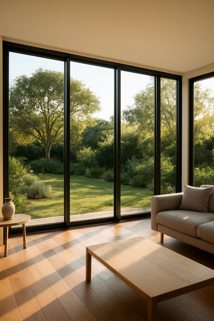
Powder-coated aluminium produces a smooth, uniform cream finish with a finely matt or satin surface that sits flat against the profile. The colour is baked into the frame at around 200 degrees Celsius, bonding at a molecular level to the metal substrate. There’s no film to peel, no foil edge to lift.
Cream uPVC relies on a laminate foil wrapped over the plastic profile. Up close, it carries a faint plastic sheen and a slightly textured grain that can look artificial in direct sunlight. The foil edges are visible at mitred corners, and over years of thermal cycling they can occasionally lift or discolour at joins. Aluminium frames are also substantially slimmer — typically 50-65 mm face widths compared to 70-80 mm on uPVC — which means more glass, thinner framing bars, and cleaner proportions on cream-finished elevations. Where uPVC colour options cap at roughly 30 finishes, aluminium opens up over 200 RAL codes. That freedom lets you coordinate cream frames precisely with other powder-coated elements — a dark brown aluminium front door in RAL 8016, for instance, or a charcoal garage frame — without being locked into whatever the uPVC supplier stocks.
Timber achieves a beautiful cream when freshly painted, but it’s a surface coating sitting on an organic substrate. Within three to five years in exposed Australian conditions, painted timber frames demand sanding and recoating to prevent flaking, moisture ingress, and eventual rot. The aesthetic payoff is real, but so is the maintenance calendar.
Standard Cream vs Woodgrain-Effect Cream Finishes
Aluminium doesn’t limit you to a flat solid colour. A sublimation process — where a printed film is heat-transferred onto the powder-coated surface — can apply highly realistic woodgrain patterns over a cream base. The result mimics the warmth of painted timber joinery while retaining aluminium’s structural and maintenance advantages: no warping, no repainting, and Qualicoat-approved UV stability.
Standard smooth cream suits contemporary and transitional builds where clean lines matter. Woodgrain-effect cream works on heritage replacements or character homes where councils want the visual softness of timber without approving actual timber profiles. Both options are available in tones like RAL colour 9007 (Grey Aluminium) as the base for metallic woodgrains, or warm cream bases paired with oak, walnut, or ash grain patterns. The finish is scratch-resistant and architecturally precise enough for flush casement detailing.
For contrast, other popular aluminium finishes — alu grey shades such as RAL colour 7047 (Telegrey 4) and RAL colour 7038 (Agate Grey) — highlight just how versatile the powder-coating palette is compared to the limited offering from uPVC suppliers. A project might combine cream window frames with brun 8019 (Grey Brown) door panels or similar earthy accents, all colour-matched through the same RAL system.
Longevity and Colour Retention by Frame Material
UV exposure is the primary enemy of any coloured frame finish in Australia. Aluminium’s powder coat resists degradation through polyester resin systems formulated with UV-stabilising additives. Chalking — a phenomenon where the surface develops a white, powdery residue as binders break down — is the key risk for lower-grade coatings. Architectural-grade powder coats (Qualicoat Class 2 or higher) are engineered to resist chalking for 20-plus years, maintaining both colour and protective integrity.
Cream uPVC foils can fade and develop a patchy, uneven tone within 10-15 years, particularly on north-facing elevations copping full sun. Timber needs repainting every 5-7 years to maintain colour fidelity, and each repaint subtly shifts the tone as new paint layers interact with previous coats.
| Factor | Aluminium (Powder-Coated) | uPVC (Foil Laminate) | Timber (Painted) |
|---|---|---|---|
| Finish consistency | Uniform, smooth, factory-baked | Foil-wrapped, slight plastic sheen | Brush or spray applied, variable |
| Frame slimness | 50-65 mm face width | 70-80 mm face width | 55-70 mm face width |
| Maintenance needs | Periodic wash only | Low — but foil damage is hard to repair | Sand and repaint every 5-7 years |
| Lifespan | 40-60+ years | 20-30 years | 30-50 years (with maintenance) |
| Colour stability | Excellent — Qualicoat-rated UV resistance | Moderate — foil fade in 10-15 years | Poor without regular repainting |
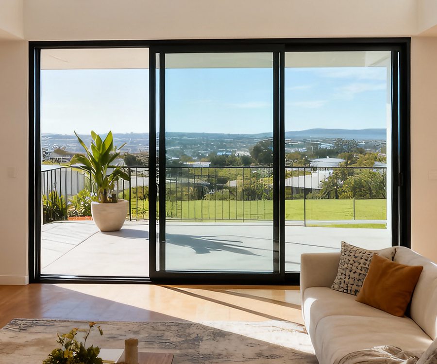
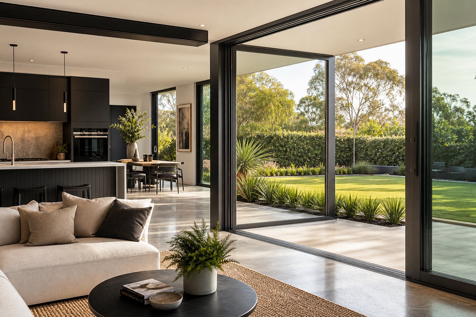
Material performance extends beyond the frame itself. Aluminium’s rigidity supports larger spans of glass without the structural reinforcement that uPVC requires internally, keeping sightlines slim and maximising natural light — a tangible advantage when cream frames are chosen precisely because they create a soft, unobtrusive border around the glazing.
Finish quality and frame profile only tell part of the story, though. Where cream aluminium windows truly flex their advantage is in dual-colour configurations — one tone facing the street, another facing your living space — a capability that neither uPVC foils nor painted timber can match with the same precision.
Dual-Colour Options with Cream Exteriors
Aluminium’s powder-coating process allows each face of a window profile to carry a different colour. That means you can present cream to the street while running an entirely separate palette inside — a level of design control that uPVC foils and painted timber simply cannot replicate with the same consistency or durability.
Popular Interior Colour Pairings with Cream Exteriors
Most homeowners choosing a cream exterior gravitate toward darker or neutral tones inside to complement their interior joinery and wall finishes. The contrast works because cream sits quietly on the facade while the interior colour anchors furniture, cabinetry, and flooring choices.
Common dual-colour combinations with a cream (RAL 9001) exterior include:
- Cream exterior with RAL 7016 (Anthracite Grey) interior — the most popular pairing, tying frames into dark kitchen cabinetry and modern grey interiors
- Cream exterior with RAL 9005 (Jet Black) interior — a bold option for industrial and contemporary living spaces where the RAL 9005 color reads as a refined, architectural black
- Cream exterior with RAL 9016 (Traffic White) interior — maintains a bright, clean internal aesthetic while softening the streetscape appearance
- Cream exterior with RAL 7016 antrasit interior paired with timber-look reveals — a layered approach for transitional homes balancing warmth and edge
- Cream exterior with 9004 RAL (Signal Black) interior — slightly softer than jet black, suited to homes with charcoal flooring and muted wall tones
- Cream exterior with ral black blue interior — an unconventional choice for studies, libraries, or statement rooms where deep, inky tones create drama
The dark-interior, light-exterior formula is especially effective in open-plan living areas where large sliding or bi-fold doors frame garden views. Inside, the darker frame recedes into the room’s shadow lines rather than competing with the outlook.
How Dual-Colour Framing Works in Practice
During manufacturing, each aluminium profile is masked and powder-coated in two separate passes — one for the external face, one for the internal. The junction typically falls along a natural break in the profile geometry, so no colour transition is visible from either side. It’s a standard capability for quality aluminium fabricators, not a bespoke add-on requiring exotic tooling.
From a planning perspective, dual-colour framing solves a common tension. Conservation areas and character overlays often mandate cream or heritage-sympathetic tones externally, but homeowners want their interiors to reflect a different aesthetic — perhaps a moody RAL 9005 black or a sleek anthracite grey. Dual-colour lets both goals coexist without compromise.
Cost and lead time do shift modestly. Expect a price premium of roughly 10-20 percent over a single-colour frame, reflecting the additional coating pass and masking labour. Lead times may extend by a few days depending on the fabricator’s workflow, though most Australian suppliers build dual-colour turnaround into their standard scheduling. Suppliers like MEICHEN offer custom dual-colour powder-coating across their aluminium window range, letting homeowners and builders specify exterior cream with their preferred interior tone across casement, awning, sliding, and fixed-lite configurations.
The real value of dual-colour goes beyond aesthetics. It future-proofs the build — if you repaint interior walls or swap cabinetry down the track, the internal frame colour remains a neutral anchor rather than a dated leftover. And because both faces carry the same architectural-grade powder coat, maintenance and longevity are identical to a single-colour frame.
Maintenance and How Cream Finishes Age
Dual-colour configurations and precise RAL specifications only matter if the finish holds its appearance over time. The good news: cream powder-coated aluminium is one of the lowest-maintenance frame options available — and the colour itself sits in a practical sweet spot that hides everyday wear better than both white and dark alternatives.
How Cream Finishes Age Compared to White and Dark Frames
Every powder-coated surface ages. The question is how visibly. Bright white frames (RAL 9003, RAL 9016) show dirt, water streaks, and mould growth quickly because any discolouration contrasts sharply against the neutral base. Dark frames — iron grey, RAL 7024 (Graphite Grey), mouse grey, or black — attract and display dust, pollen, and fine scratches that catch the light. Darker coatings also absorb more UV energy, accelerating the breakdown of resin binders at the surface.
Cream occupies a forgiving middle ground. Its warm undertone absorbs minor discolouration into the existing tonal range rather than advertising it. Water spots dry without leaving obvious tide marks. Light dust and pollen don’t pop against the surface the way they do on a RAL9006 (White Aluminium) or RAL colour 9006 metallic frame. And because cream reflects a high proportion of UV radiation — similar to white — the resin binders in the powder coat degrade more slowly than they would on a dark profile.
Over 15 to 20 years, you might notice a very slight softening of gloss on cream frames. This gradual gloss loss is not the same as chalking. Chalking occurs when UV breaks down the resin to the point where loose pigment particles form a powdery film on the surface — rub your finger across it and you’ll see white residue. Architectural-grade polyester powder coats (Qualicoat Class 2 or higher) are formulated to resist chalking for 20-plus years in typical Australian conditions. When chalking eventually does occur on lighter colours like cream, it’s far less visually obvious than on dark tones, where it produces a milky haze that looks immediately tired.
Cleaning and Care for Cream Powder-Coated Frames
Regular cleaning is the single most effective way to extend the life and appearance of any powder-coated finish. For cream frames in a standard suburban setting, a wash every three to six months keeps the surface looking fresh. Coastal properties — anywhere within five kilometres of the shoreline — need attention every two to three months because salt deposits corrode fittings and degrade coatings if left to accumulate. Industrial areas with airborne pollutants (sulphur compounds, soot) call for a similar frequency.
The routine itself is straightforward:
- Rinse frames with clean water to remove loose grit and salt — a garden hose on gentle pressure is fine, but avoid high-pressure washers aimed directly at seals and drainage slots.
- Mix a mild dishwashing liquid into a bucket of warm water. Nothing harsher is needed; avoid bleach, solvents, ammonia-based cleaners, or abrasive cream cleansers.
- Wipe all frame faces, sills, and tracks with a soft microfibre cloth or non-abrasive sponge. Pay attention to corners and drainage holes where grime accumulates.
- Rinse thoroughly with clean water so no soap residue remains — dried detergent can leave a film that attracts fresh dust.
- Dry frames with a soft towel or chamois to prevent mineral water spots, especially in hard-water areas.
- Inspect hardware, seals, and drainage holes while cleaning. Clear any blockages with a cotton bud or soft brush so water can exit the frame as designed.
Avoid steel wool, scouring pads, or abrasive brushes — these scratch the powder-coat surface and create entry points for moisture. Similarly, solvent-based cleaners (turpentine, acetone, methylated spirits) can strip or dull the finish permanently.
Most quality aluminium window manufacturers back their powder-coat finishes with warranties ranging from 10 to 25 years, depending on coating grade and environmental exposure class. Fluorocarbon (PVDF) coatings offer the longest protection — up to 30 years — though standard architectural polyester remains the most common choice for residential cream frames, delivering reliable performance for 15 to 25 years before any recoating might be considered.
In marine and industrial environments, the coating itself may perform well while hardware and fixings show corrosion earlier. Stainless steel or marine-grade fasteners paired with regular salt removal keep the entire assembly aligned with the powder coat’s lifespan rather than letting a single corroded screw undermine the frame’s integrity.
Maintenance is one variable you control entirely. The other — getting the right cream shade specified and confirmed before manufacture — requires a slightly different kind of diligence, one that happens at the ordering stage rather than after installation.
Specifying Cream Aluminium Windows for Your Project
Choosing cream is the easy part. Translating that preference into a precise, repeatable specification that survives the journey from concept to installed frame requires a few deliberate steps — steps that happen well before any aluminium profile is cut or coated.
How to Specify Cream When Ordering Aluminium Windows
Start with a RAL code, not a colour name. Telling a supplier you want “cream” leaves room for interpretation — one fabricator might default to RAL 9001, another to RAL 1013, and a third to something closer to RAL 7001 (Silver Grey) if they misread the brief. Providing the exact four-digit code eliminates ambiguity. If you’re unsure which cream shade suits your build, request sample chips for the two or three codes in contention (RAL 9001, RAL 1013, RAL 1015) and evaluate them against your actual facade materials before locking anything in.
Your supplier should confirm several details at the quoting stage:
- The RAL code for exterior face and, if dual-colour, the interior code
- Finish sheen level — matt, satin, or gloss (satin is standard for most residential cream frames)
- Coating grade — standard architectural polyester or higher-durability options for coastal or industrial exposures
- Whether the code is a stock colour or requires a custom batch (stock colours like RAL 9001 typically ship faster)
Communicate clearly and early. Colour decisions should be finalised during the design development or pre-construction phase — not left to the last minute when frames are already in fabrication queue. Most suppliers lock colour at order confirmation, which means changes after that point incur delays and potential restocking charges. For larger commercial projects, standardising on a single cream code across all elevations simplifies procurement and avoids batch-to-batch variation showing up on the finished building.
Viewing Samples and Confirming Your Shade On Site
A RAL fan deck viewed indoors under LED lighting tells you very little about how cream will read on your facade at midday, dusk, or under overcast skies. Physical powder-coated aluminium sample panels are the only reliable reference. Request a sprayed sample on actual aluminium substrate — not a painted card, not a plastic chip — because the metallic base beneath the powder coat subtly influences how light interacts with the surface.
Once you have the sample, hold it directly against your brickwork, render, cladding, or stonework at different times of day. Morning sun will push the cream toward a cooler read, while afternoon light draws out the warmth. Overcast conditions tend to flatten the colour and make subtle undertones more apparent. This on-site evaluation reveals whether your chosen code harmonises with surrounding materials or clashes in ways a showroom visit never could.
For projects involving multiple trades and finishes — say, cream window frames alongside a RAL 7004 (Signal Grey) fascia or powder-coated balustrade — viewing all colour samples together on site is critical. Colours interact. A cream that looks perfect in isolation might feel too warm next to a cool grey element, or too flat beside a warmer accent. Coordinating samples early prevents expensive recoating or compromises during installation. Similarly, if neighbouring elements use a darker neutral like RAL 7047 (Telegrey 4) or a deep tone approaching 7024 RAL (Graphite Grey), confirming the tonal relationship between all coated surfaces saves second-guessing later.
Professional colour matching reinforces this process. As industry coaters explain, Delta E measurements — a numerical expression of colour difference — ensure batch consistency sits below the threshold where the human eye detects variation. For cream shades, even small shifts can become noticeable when panels are installed side by side across a long elevation. Requesting Delta E compliance from your coater adds a layer of insurance that every frame delivered to site matches the approved sample.
Specify by RAL code, not colour name. Request a powder-coated aluminium sample — not a card swatch — and evaluate it against your facade materials at multiple times of day. Lock in your colour before order confirmation, coordinate with adjacent finishes on site, and ask your supplier about Delta E consistency for multi-frame installations.
One final consideration: don’t confuse screen-based colour representations with reality. RAL 9005 RGB values, digital colour pickers, and online swatch tools are useful for narrowing options, but they cannot replicate how a baked powder coat reflects Australian sunlight on a textured aluminium profile. Screens emit light; coated frames reflect it. The gap between those two experiences is exactly why physical sampling matters.
For homeowners, builders, and project teams ready to move from research to specification, MEICHEN’s aluminium window range supports custom RAL colour selection including cream shades across casement, awning, sliding, and fixed-lite configurations — suited to both residential and commercial builds across Australia. It’s a practical starting point for matching the right cream tone to the right window type for your project.
Frequently Asked Questions About Cream Aluminium Windows
1. What RAL colour code is used for cream aluminium windows?
RAL 9001 (Cream) is the standard code most suppliers use when specifying cream aluminium windows. It produces a warm, balanced off-white with a subtle yellow-grey undertone that reads distinctly softer than pure white codes like RAL 9016 or RAL 9003. Related cream-family options include RAL 1013 (Oyster White) with a golden-sand warmth, RAL 1015 (Light Ivory) with a pale custard tone, and RAL 1014 (Ivory) for a deeper, richer warmth suited to heritage projects. Always specify the exact four-digit RAL code rather than relying on colour names to avoid misinterpretation between suppliers.
2. Are cream aluminium windows better than white for heritage homes?
Cream is generally a stronger fit for heritage and character homes because its warm undertone echoes the aged patina of traditional painted timber joinery. Conservation areas and heritage overlays in Australia frequently specify cream or off-white tones as acceptable replacements, whereas bright white can be flagged as visually unsympathetic to period streetscapes. Cream pairs naturally with sandstone, warm brick, and rendered finishes common on Federation terraces, Edwardian villas, and interwar bungalows, creating a cohesive facade rather than a high-contrast clash.
3. How do cream aluminium windows compare to cream uPVC frames?
Powder-coated aluminium achieves a smoother, more uniform cream finish than uPVC, which relies on a laminate foil that can carry a plastic sheen and lift at mitred corners over time. Aluminium frames are also slimmer — typically 50-65 mm versus 70-80 mm on uPVC — resulting in more glass area and cleaner sightlines. Colour stability is superior on aluminium, with Qualicoat-rated coatings retaining their tone for 20-plus years, while uPVC foils can fade unevenly within 10-15 years on sun-exposed elevations. Aluminium also offers access to over 200 RAL codes for precise colour coordination across other building elements.
4. Can I have cream on the outside and a different colour inside my aluminium windows?
Yes, dual-colour powder-coating is a standard capability for quality aluminium fabricators. Each face of the window profile is masked and coated separately, allowing cream on the exterior for streetscape harmony while the interior carries a contrasting colour like anthracite grey (RAL 7016), jet black (RAL 9005), or traffic white (RAL 9016). This is particularly useful where council heritage requirements mandate cream externally but your interior design calls for a darker or cooler tone. Expect a 10-20 percent price premium over single-colour frames due to the additional coating pass.
5. How do you maintain cream powder-coated aluminium window frames?
Cream powder-coated frames require only periodic washing — every three to six months in standard suburban settings, or every two to three months in coastal areas where salt accumulates. Use a soft cloth with warm water and mild dishwashing liquid, rinse thoroughly, and dry to prevent mineral spots. Avoid abrasive pads, steel wool, and solvent-based cleaners as these damage the powder coat. Cream is more forgiving than white for showing dirt and water marks, and lighter than dark frames that highlight dust and scratches, making it one of the most practical colour choices for long-term appearance.
More Window & Door Guides